How to remain true to your brand while building your new website?
Welcome to the rollercoaster world of startups – full of excitement, ever-growing anticipations, adrenaline-pumping experiments, and some major life-changing experiences. While the growth of a startup can be dependent on about a gazillion factors, the one that is the most crucial is brand consistency.
According to research, when customers report a “positive feeling” from a brand, they are more connected to that business, making them far more likely to transact. This applies to B2C and B2B brands! Once you’ve locked your identity, brand values, positioning, and targeting, it’s time to carve an exclusive experience for your target audience through your website. This goes well beyond just the logo that you see at the top left corner of your site.
Everything – from the colors or fonts that you choose to the content that you put out is a shadow of your brand. But slapping them together just for the sake of drawing attention can make visitors have second thoughts about your brand.
So what should you do? Try and imbibe these four tips to build a website that enables brand consistency and helps you to remain true to your brand identity without compromising on the user’s experience!
Start with a cohesive color scheme
Seeing red. Feeling blue. Tickled pink.
Common idioms used in our day-to-day lives are a great example of how we often associate colors with emotions. Whether it’s red with aggression, blue with serenity, or black with power. Colors are the subconscious reason behind the way you paint your house, the outfits you wear, or even the food that you’re most drawn to. So there’s no surprise that the colors you pick for your website will subconsciously alter the experience for your users. And it doesn’t mean that you have to completely depend on the color of your logo. Let’s break this down:
- Start by identifying your brand’s personality. What are the few adjectives that describe your business? Casual? Modern? Playful?
- Who are you targeting? What are their taste and palate?
- Once you’ve identified your key traits and users, it’s time to pick colors that best embody those adjectives. This is where color psychology comes into play.
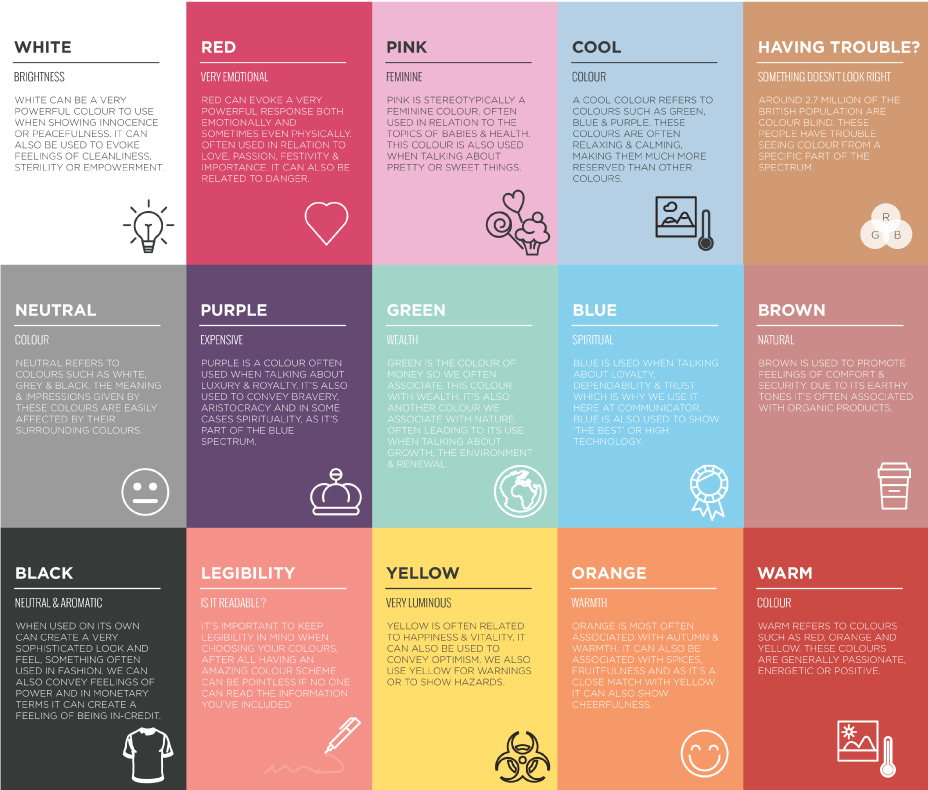
- Now that you have your core brand colors decided, integrate them into your website. Use a dominant color as a base and apply it throughout your website headlines, CTAs, background images, – basically, areas that people naturally gravitate towards. Use subtle shades to the more functional aspects of your website like top menu, navigational bars, sidebar icons, etc.
In most cases, using just two or three colors is perceived as appealing. Sticking to a color palette becomes very important for brand consistency and ultimately your business.
Also Read: How does digital branding impact your business in today’s age?
Understand the influence of whitespace
When you look at the web design of successful websites like Apple, Dropbox, or Shopify, you’ll realize that there’s one thing that dictates all – the use of whitespace.
Whitespace is one of the most overlooked and underutilized aspects of a great web layout. In fact, research conducted by Human Factors International shows that whitespace boosts comprehension by 20%.
When you’re putting together a website, it can be tempting to fill it up with as much content, images, or elements as possible. We can understand the excitement of sharing everything about your business with your visitors. However, sometimes the result ends up looking something like this:

Enter, whitespace. It is exactly what it sounds like, and despite its apparent simplicity, it’s a vital part of any visual design. Apart from giving a higher degree of sophistication and prestige to a website’s UI, whitespace design is very beneficial for a user’s readability and navigating their attention. It helps by providing an absorbable amount of content to the user upfront, it causes you to prioritize which content to show first and how much emphasis to place on it.
Communicate through your typography
Yes, the words on your website matter but how those words look plays an equally important role. While less flashy than colors and imagery, your brand’s font tells a story by bringing a voice and personality to your website. Hence they must maintain brand consistency. There are a variety of styles to choose from, but it doesn’t mean you go overboard with them. There certainly should be a balance when selecting fonts. Don’t go with just one single style which makes it hard to differentiate between sections of content. Nor with so many that it becomes too distracting for the user. The best path is to swing between two to four fonts and use them across all your communication.
Whether you go for classic serif or distinctive decorative fonts, make sure they are readable enough at first glance. If your headline, subheading, or copy is difficult to read, no matter what font you choose, you will run a risk of losing a reader even before they head on to the content.
Add a touch of graphics

We’ve all heard that “content is king”, but well-written blogs, product descriptions, or any important information on your website is incomplete without some good imagery. The images you use on your website add a visual appeal but there is more to them than just aesthetics. The graphics on your website make the content more memorable. Use subtle imagery that doesn’t distract visitors from the brand messaging. Whether stock photography, product images, gifs, or infographics, make sure they are of the best quality, compliment, or add to the content and are placed where your audience can best understand them.
Looking for branding done for your business? Drop us a message here and we would love to help.